Touch UI Component Dialog Examples
The following chapters each present a coral xml snippet which can be copied into any /components/mycomponent/_cq_dialog/.content.xml file.
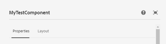
Empty Dialog / Starting Point
This is an empty dialog structure and components can be placed in tabs (you can add n tabs.)
<?xml version="1.0" encoding="UTF-8"?>
<jcr:root xmlns:sling="http://sling.apache.org/jcr/sling/1.0" xmlns:granite="http://www.adobe.com/jcr/granite/1.0" xmlns:cq="http://www.day.com/jcr/cq/1.0" xmlns:jcr="http://www.jcp.org/jcr/1.0" xmlns:nt="http://www.jcp.org/jcr/nt/1.0"
          jcr:primaryType="nt:unstructured"
          jcr:title="MyTestComponent"
          sling:resourceType="cq/gui/components/authoring/dialog"
          helpPath="https://url-to-your-documentation.com">
    <content
            granite:class="cmp-mytestcmp__editor"
            jcr:primaryType="nt:unstructured"
            sling:resourceType="granite/ui/components/coral/foundation/container">
        <items jcr:primaryType="nt:unstructured">
            <tabs
                    jcr:primaryType="nt:unstructured"
                    sling:resourceType="granite/ui/components/coral/foundation/tabs"
                    maximized="{Boolean}true">
                <items jcr:primaryType="nt:unstructured">
                    <properties
                            jcr:primaryType="nt:unstructured"
                            jcr:title="Properties"
                            sling:resourceType="granite/ui/components/coral/foundation/container"
                            margin="{Boolean}true">
                        <items jcr:primaryType="nt:unstructured">
                            <columns
                                    jcr:primaryType="nt:unstructured"
                                    sling:resourceType="granite/ui/components/coral/foundation/fixedcolumns"
                                    margin="{Boolean}true">
                                <items jcr:primaryType="nt:unstructured">
                                    <column
                                            jcr:primaryType="nt:unstructured"
                                            sling:resourceType="granite/ui/components/coral/foundation/container">
                                        <items jcr:primaryType="nt:unstructured">
                                        <!--  Place your components / dialog fields here  -->
                                        </items>
                                    </column>
                                </items>
                            </columns>
                        </items>
                    </properties>
                    <layout
                            jcr:primaryType="nt:unstructured"
                            jcr:title="Layout
                            sling:resourceType="granite/ui/components/coral/foundation/container"
                            margin="{Boolean}true">
                        <items jcr:primaryType="nt:unstructured">
                            <columns
                                    jcr:primaryType="nt:unstructured"
                                    sling:resourceType="granite/ui/components/coral/foundation/fixedcolumns"
                                    margin="{Boolean}true">
                                <items jcr:primaryType="nt:unstructured">
                                    <column
                                            jcr:primaryType="nt:unstructured"
                                            sling:resourceType="granite/ui/components/coral/foundation/container">
                                        <items jcr:primaryType="nt:unstructured">
                                        <!--  Place your components / dialog fields here  -->
                                        </items>
                                    </column>
                                </items>
                            </columns>
                        </items>
                    </layout>
                </items>
            </tabs>
        </items>
    </content>
</jcr:root>
You can write a class or id to your dialog fragment by adding granite:class="some-css-class" or granite:id="some-id". Add required="{Boolean}true" to any component field to mark it as required.
Note, that the actual xml item element tag name, can be anything, as long as its unique for this component.
For example, the Alert field xml does not need to be named alert.
Simple Data Fields
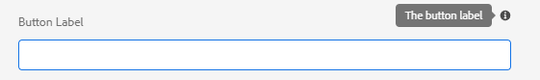
Textfield
<textfield
   jcr:primaryType="nt:unstructured"
   sling:resourceType="granite/ui/components/coral/foundation/form/textfield"
   fieldDescription="The button label"
   fieldLabel="Button Label"
   name="./label"/>
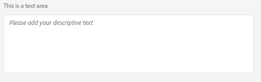
Textarea
<textarea
   jcr:primaryType="nt:unstructured"
   sling:resourceType="granite/ui/components/coral/foundation/form/textarea"
   fieldLabel="This is a text area"
   emptyText="Please add your descriptive text"
   name="./textareacontent"/>
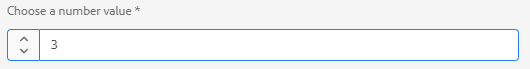
Numberfield
You can define the min, max value and the increments, in which the input can be set.
<numberfield
    jcr:primaryType="nt:unstructured"
    sling:resourceType="granite/ui/components/coral/foundation/form/numberfield"
    fieldLabel="Choose a number value"
    name="./numbervalue"
    min="{Long}1"
    max="{Long}10"
    step="{Double}1"/>
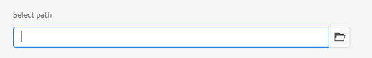
Pathfield
<pathfield
   jcr:primaryType="nt:unstructured"
   sling:resourceType="granite/ui/components/coral/foundation/form/pathfield"
   fieldLabel="Select path"
   rootpath="/content"
   name="./path"/>
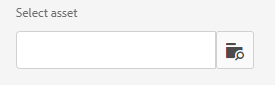
Pathbrowser
In some cases you might want to use the older coral2 pathbrowser component https://experienceleaguecommunities.adobe.com/t5/adobe-experience-manager/when-to-choice-pathbrowser-as-well-as-pathfield/m-p/312540/highlight/true#M32451.
You can recognize the Coral 3 components by the path /components/coral/foundation. The older Coral 2 variants live
in /components/foundation.
<pathbrowser
   jcr:primaryType="nt:unstructured"
   sling:resourceType="granite/ui/components/foundation/form/pathbrowser"
   fieldLabel="Select asset"
   rootpath="/content/dam"
   name="./assetpath"/>
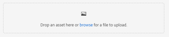
Asset Upload
<file
    jcr:primaryType="nt:unstructured"
    sling:resourceType="cq/gui/components/authoring/dialog/fileupload"
    class="cq-droptarget"
    fileNameParameter="./fileName"
    fileReferenceParameter="./fileReference"
    mimeTypes="[image/gif,image/jpeg,image/png,image/tiff,image/svg+xml]"
    name="./file"/>
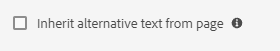
Checkbox
<checkbox
    jcr:primaryType="nt:unstructured"
    sling:resourceType="granite/ui/components/coral/foundation/form/checkbox"
    checked="true"
    name="./altValueFromPageImage"
    text="Inherit alternative text from page"
    uncheckedValue="false"
    value="{Boolean}true"/>
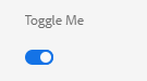
Switch
<switch
   jcr:primaryType="nt:unstructured"
   sling:resourceType="granite/ui/components/coral/foundation/form/switch"
   checked="true"
   name="./switchValue"
   fieldLabel="Toggle Me"
   uncheckedValue="false"
   value="{Boolean}true"/>
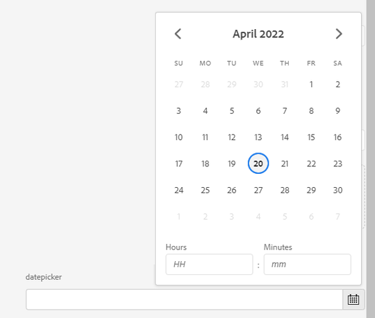
Datepicker
<datepicker
   jcr:primaryType="nt:unstructured"
   sling:resourceType="granite/ui/components/coral/foundation/form/datepicker"
   displayedFormat="MM-DD-YYYY HH:mm"
   fieldLabel="datepicker"
   name="./datepicker"
   type="datetime"
   typeHint="Date"/>
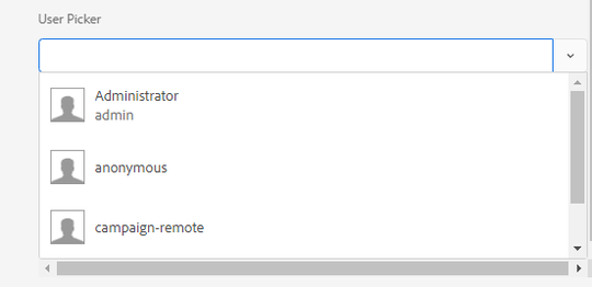
Userpicker
<userpicker
    jcr:primaryType="nt:unstructured"
    sling:resourceType="granite/ui/components/coral/foundation/form/userpicker"
    fieldLabel="User Picker"
    hideServiceUsers="{Boolean}true"
    impersonatesOnly="{Boolean}false"
    name="./user"/>
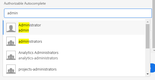
Authorizable Autocomplete
<authautocomplete
    jcr:primaryType="nt:unstructured"
    sling:resourceType="granite/ui/components/coral/foundation/authorizable/autocomplete"
    fieldLabel="User Picker"
    name="./user"/>
Complex Data Fields
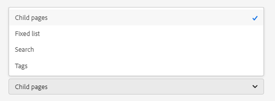
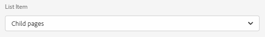
Select Dropdown
<select
        jcr:primaryType="nt:unstructured"
        sling:resourceType="granite/ui/components/coral/foundation/form/select"
        fieldLabel="List Item"
        name="./selectItem">
    <items jcr:primaryType="nt:unstructured">
        <children
                jcr:primaryType="nt:unstructured"
                text="Child pages"
                value="children"/>
        <static
                jcr:primaryType="nt:unstructured"
                text="Fixed list"
                value="static"/>
        <search
                jcr:primaryType="nt:unstructured"
                text="Search"
                value="search"/>
        <tags
                jcr:primaryType="nt:unstructured"
                text="Tags"
                value="tags"/>
    </items>
</select>
Opend
Closed
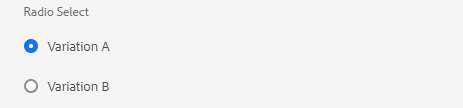
Radio Select
<radio
        jcr:primaryType="nt:unstructured"
        sling:resourceType="granite/ui/components/coral/foundation/form/radiogroup"
        name="./radioselection"
        vertical="{Boolean}true"
        fieldLabel="Radio Select">
    <items jcr:primaryType="nt:unstructured">
        <vara
                jcr:primaryType="nt:unstructured"
                text="Variation A"
                value="var-a"/>
        <varb
                jcr:primaryType="nt:unstructured"
                text="Variation B"
                value="var-b"/>
    </items>
</radio>
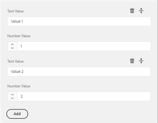
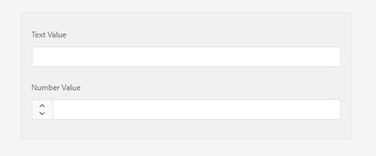
Multifield
A multifield wraps a predefined group of components and lets an author create n of these sets. The data will be saved to subnotes.
Access that data via @ChildResource Annotation in your Sling Model, as described here.
Add composite="{Boolean}true" to save the entries as a child node which in return can easily be injected into a Sling Model via @ChildResource.
Otherwise all values entered will be stored on the node itself as Array Properties.
<myMultifield
    jcr:primaryType="nt:unstructured"
    sling:resourceType="granite/ui/components/coral/foundation/form/multifield"
composite="{Boolean}true"
    required="{Boolean}true">
    <field
        jcr:primaryType="nt:unstructured"
        sling:resourceType="granite/ui/components/coral/foundation/container"
        name="./values">
        <items jcr:primaryType="nt:unstructured">
            <textvalue
                jcr:primaryType="nt:unstructured"
                sling:resourceType="granite/ui/components/coral/foundation/form/textfield"
                fieldLabel="Text Value"
                name="./textvalue"/>
            <numbervalue
                 jcr:primaryType="nt:unstructured"
                 sling:resourceType="granite/ui/components/coral/foundation/form/numberfield"
                 fieldLabel="Number Value"
                 name="./numbervalue"/>
        </items>
    </field>
</myMultifield>
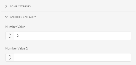
Accordion
You can add a parentConfig block with active to set the accordion to be opened by default.
Any dialog field can be added to each accordion item items block.
<accordion
        jcr:primaryType="nt:unstructured"
        sling:resourceType="granite/ui/components/coral/foundation/accordion"
        variant="default">
    <items jcr:primaryType="nt:unstructured">
        <block1
                jcr:primaryType="nt:unstructured"
                jcr:title="Some Category"
                sling:resourceType="granite/ui/components/coral/foundation/container"
                maximized="{Boolean}true">
            <items jcr:primaryType="nt:unstructured">
                <textvalue1
                        jcr:primaryType="nt:unstructured"
                        sling:resourceType="granite/ui/components/coral/foundation/form/textfield"
                        fieldLabel="Text Value"
                        name="./textvalue"/>
                <textvalue2
                        jcr:primaryType="nt:unstructured"
                        sling:resourceType="granite/ui/components/coral/foundation/form/textfield"
                        fieldLabel="Text Value 2"
                        name="./textvalue2"/>
            </items>
            <parentConfig
               jcr:primaryType="nt:unstructured"
               active="{Boolean}true"/>
        </block1>
        <block2
                jcr:primaryType="nt:unstructured"
                jcr:title="Another Category"
                sling:resourceType="granite/ui/components/coral/foundation/container"
                maximized="{Boolean}true">
            <items jcr:primaryType="nt:unstructured">
                <numbervalue
                        jcr:primaryType="nt:unstructured"
                        sling:resourceType="granite/ui/components/coral/foundation/form/numberfield"
                        fieldLabel="Number Value"
                        name="./numbervalue"/>
                <numbervalue2
                        jcr:primaryType="nt:unstructured"
                        sling:resourceType="granite/ui/components/coral/foundation/form/numberfield"
                        fieldLabel="Number Value 2"
                        name="./numbervalue2"/>
            </items>
        </block2>
    </items>
</accordion>
Layout & Read Only
Alert
<alert
   granite:class="cmp-editor-alert"
   jcr:primaryType="nt:unstructured"
   sling:resourceType="granite/ui/components/coral/foundation/alert"
   size="S"
   jcr:title="Some-Title"
   text="Alert text"
   variant="warning"/>
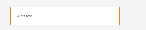
You could now leverage the css class cmp-editor-alert to set the alert box div to e.g width: 100%.
Hyperlink
<hyperlink
   jcr:primaryType="nt:unstructured"
   sling:resourceType="granite/ui/components/coral/foundation/hyperlink"
   target="_blank"
   rel="noopener noreferrer"
   text="Granite Hyperlink Documentation"
   icon="link"
   href="https://developer.adobe.com/experience-manager/reference-materials/6-5/granite-ui/api/jcr_root/libs/granite/ui/components/coral/foundation/hyperlink/index.html"/>

Check the Coral UI Icon List for available icons.
When adding these kinds of read only components, you will most likely need to add custom css via granite:class="someclass" to fix/update the layout.
For example, set display:block, to move the next item to a new line.
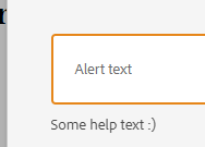
Text
You can add simple, readonly text to the dialog. This lets you add "notes" or declarative text.
<text
   jcr:primaryType="nt:unstructured"
   sling:resourceType="granite/ui/components/coral/foundation/text"
   text="Some help text :)"/>
Heading
<heading
    jcr:primaryType="nt:unstructured"
    sling:resourceType="granite/ui/components/coral/foundation/heading"
    level="{Long}2"
    text="Some Heading"/>

Well
A Well groups items together visually, by adding a background color and a small margin.
<wellGroup jcr:primaryType="nt:unstructured"
               sling:resourceType="granite/ui/components/coral/foundation/well">
    <items jcr:primaryType="nt:unstructured">
        <textvalue1
                jcr:primaryType="nt:unstructured"
                sling:resourceType="granite/ui/components/coral/foundation/form/textfield"
                fieldLabel="Text Value"
                name="./textvalue"/>
        <somenumber
                jcr:primaryType="nt:unstructured"
                sling:resourceType="granite/ui/components/coral/foundation/form/numberfield"
                fieldLabel="Number Value"
                name="./numbervalue2"/>
    </items>
</wellGroup>
Some examples from Aanchal Sikka